![]()
![]()
Stretchable Color Ramps
This package was written out of sheer anger. Many visulization tasks involve plotting heatmaps, where colors represent numeric values. There is a high number of extensions that have pre-defined components to make such representations with color palettes, but having precise control over the exact relationship between colors and values is a constant technical nuissance. The rampage extension aims to make this control easier and allow users to construct and use color ramps based on explicit relationships between colors and values.
Example 1: Topographies
Consider this coarsened version of the ETOPO topographic relief model (0.25x0.25 degree resolution of the cell-registered version of ETOPO1), using the widely-used extension package terra.
library(rampage)
library(terra)

# load data
tmp <- paste0(tempdir(), "etopo1.nc")
download.file("https://adamtkocsis.com/rampage/etopo1_Ice_c_gdal_0.1.nc", tmp)
etopo <- rast(tmp)

# use a built-in dataset to get color to elevation bindings
data(topos)

# the levels: a data frame with two columns
levs<- topos$etopo

# expand to a full ramp
ramp <- expand(levs, n=500)

# plotting
plot(etopo, col=ramp$col, breaks=ramp$breaks, legend=FALSE)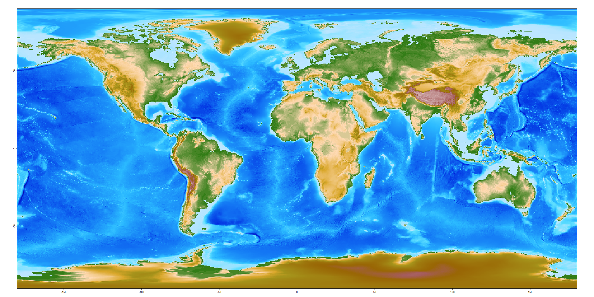
Example 2: Heatmaps
The visual message of a heatmap-figure is highly influenced by the dominance of specific colors in the heatmap. For instance, let’s consider these example data that come form a slightly shifted (non-zero mean) Gaussian distribution:
library(rampage)

set.seed(1)
# random values in a matrix
vals<- matrix(rnorm(100, mean=-0.7, sd=0.5), ncol=10)

# the histogram of the values
hist(vals, breaks=20)
abline(v=mean(vals), col="red")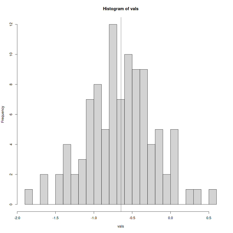
This small set of data is wrapped in a matrix to give the values some positional context, similar to spatial data. When these data are visualized, the automatic ramping will use the range of values provided for the plotting function: for instance, the default plotting with the fields package:
## Loading required package: spam

## Spam version 2.11-4 (2026-05-28) is loaded.
## Type 'help( Spam)' or 'demo( spam)' for a short introduction
## and overview of this package.
## Help for individual functions is also obtained by adding the
## suffix '.spam' to the function name, e.g. 'help( chol.spam)'.

##
## Attaching package: 'spam'

## The following objects are masked from 'package:base':
##
##     backsolve, forwardsolve

## Loading required package: viridisLite

## Loading required package: RColorBrewer

##
## Try help(fields) to get started.

##
## Attaching package: 'fields'

## The following object is masked from 'package:terra':
##
##     describe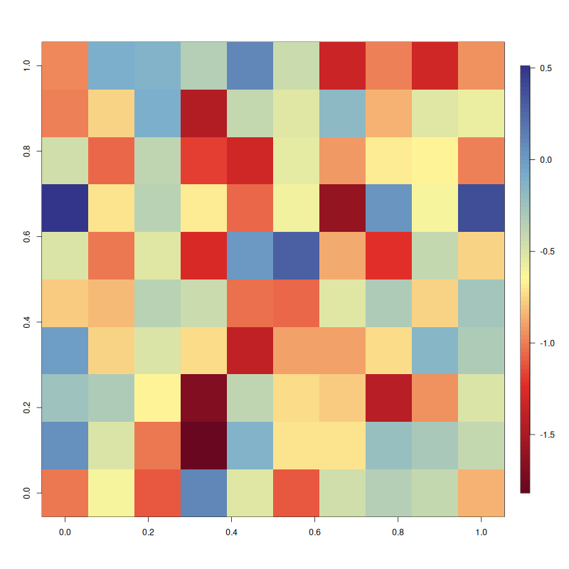
This solution is fine, if the goal of the heatmap is to visualize where the values are relative to the overall distribution, but not not where they are compared to some other value in the same dimension.
For example, assuming that the values represent changes from a previous state, it might be important to highlight the 0 level, clearly separating increases (positive) from decreases (negative values), for which we can use the yellow color. This task can be solved by defining a calbirated color ramp, that can be constructed with some value (z) to color (color) tiepoints in a data.frame:
df <- data.frame(
  z=c(-2, -0.5, 0, 0.5, 2),
  color=rev(gradinv(5))
)
dfThis data.frame can then be expanded to a full, calibrated color ramp with the rampage::expand function. The resulting object can be used to control fields::imagePlot via its breaks argument:
# calibrated color ramp
ramp <- expand(df, n=100) # check: str(ramp)

# The modified color ramp
imagePlot(vals, breaks=ramp$breaks, col=ramp$col)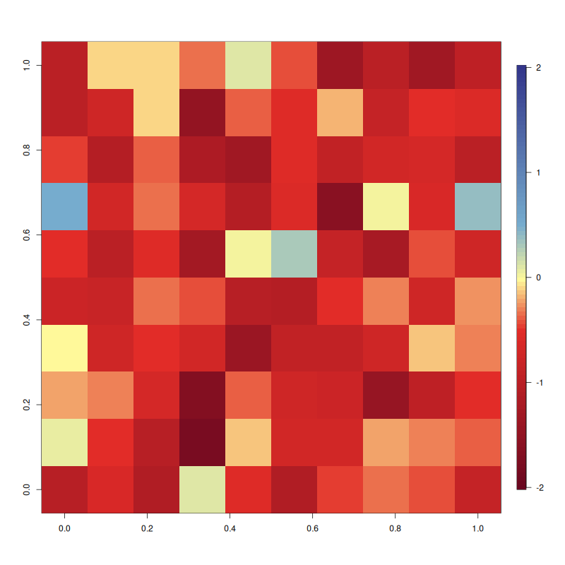
This second figure shows the same data, but the red color now consistently indicates decreases over the visualized field.